Payhawk is redesigning the Payhawk Web Portal navigation. The apps you have been using will remain the same, but where you find them and how you move between them is changing.
What changes
The Payhawk Web Portal introduces the following changes:
The Expenses app becomes Spend, because the new name is broader in meaning and not every type of spend is an expense.
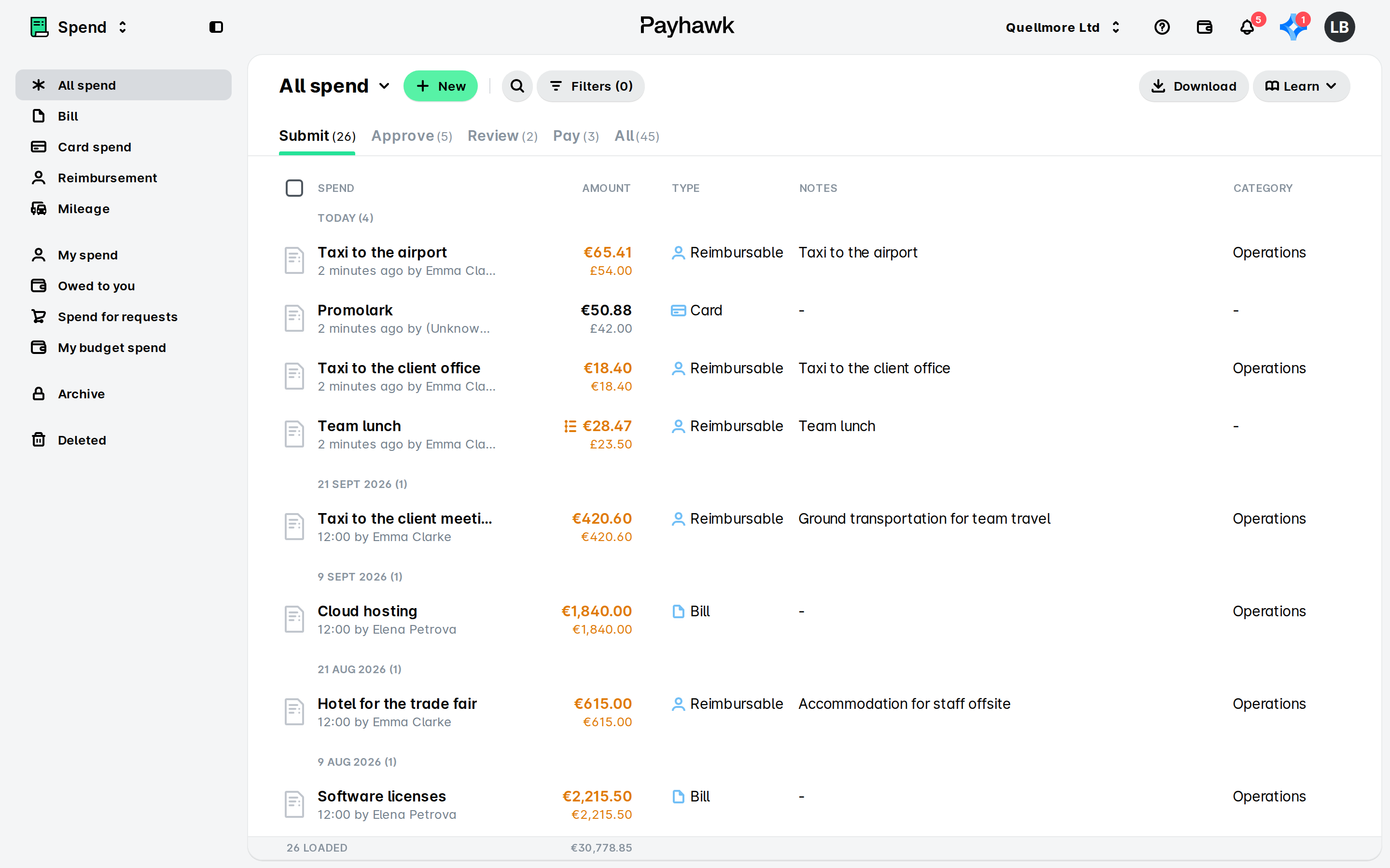
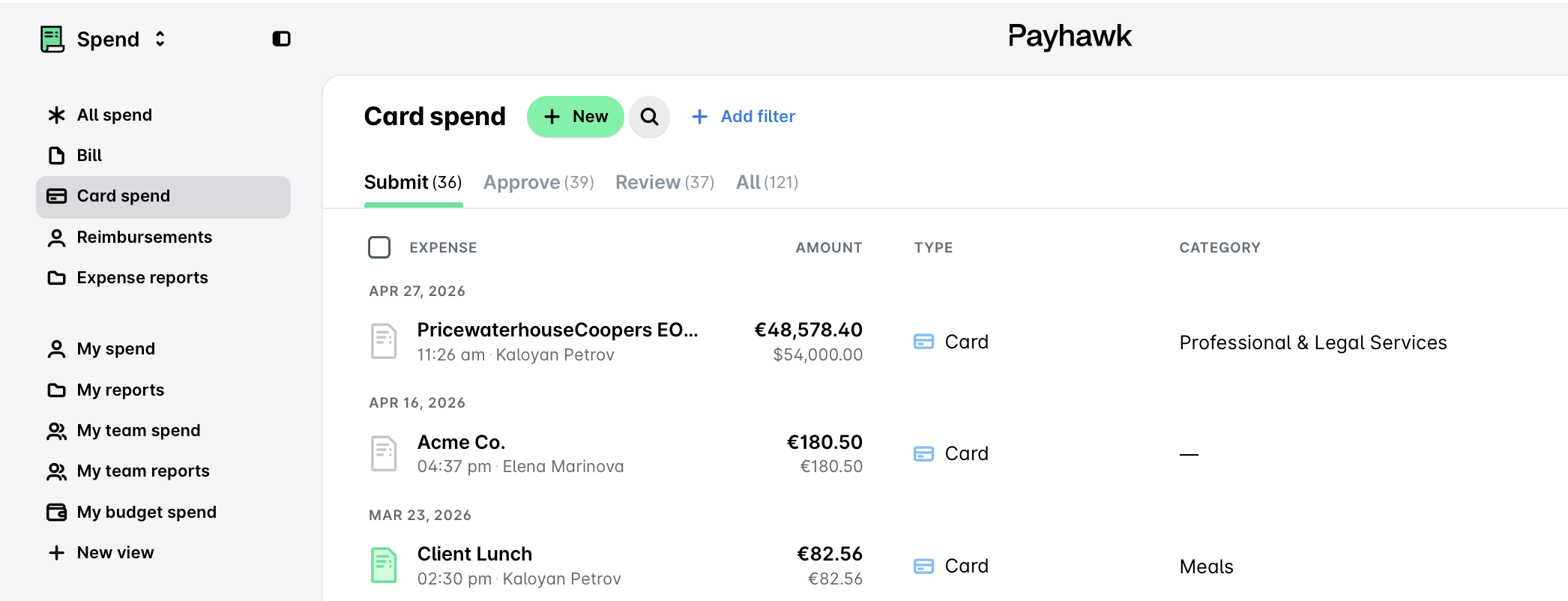
The different spend types, such as Bill, Card spend, or Reimbursement, appear in the side panel, so that you no longer have to filter by spend type.
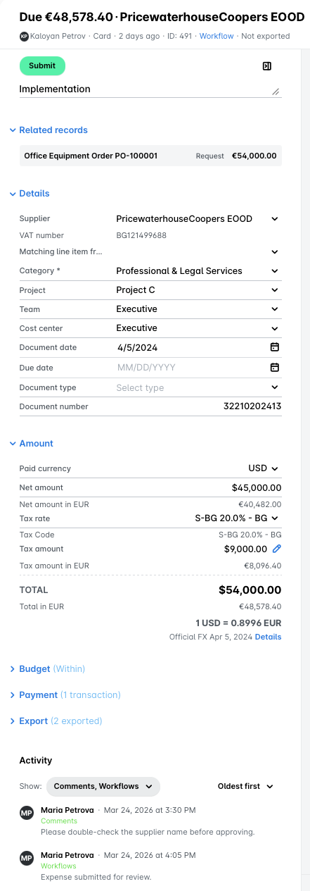
The expense details become denser, resizable, and include editable line items in the Amount section, which shows all amounts in one column.
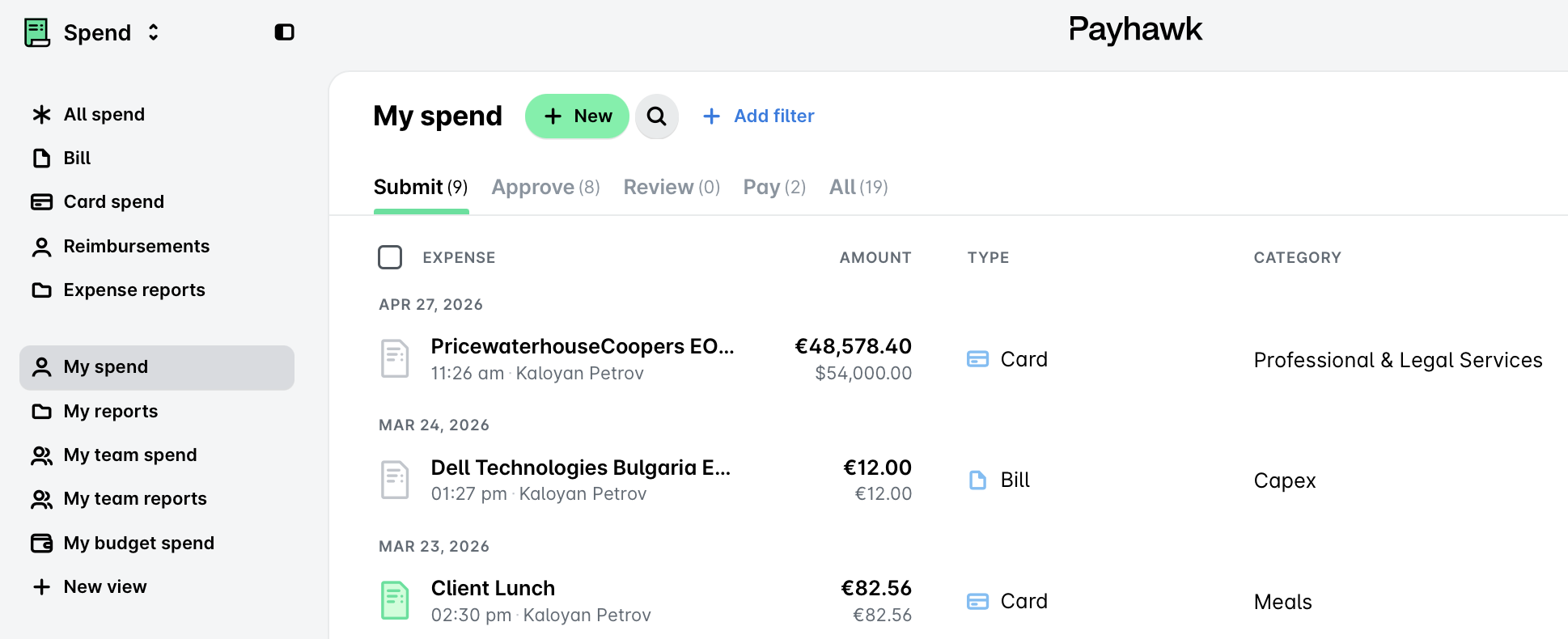
Saved views become accessible from the side panel. For example, if you’re a Payhawk Administrator, you can now access the All spend and My spend from the side panel.
The Inbox and notifications are still available in the top-right bar, but they’re also accessible from the app switcher in the top left. The AI Office opens from its icon in the top-right bar. To see it in full screen, click on the expand icon at the top of the AI Office panel.
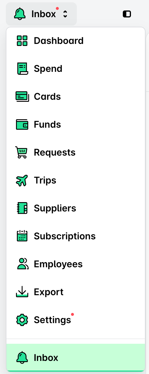
The app switcher and side panel become available after your entity completes onboarding and verification, including the billing step. Until then, you can use the Dashboard. If you have several entities, each active one will show the full navigation as usual. For any questions, contact your Payhawk representative.
What each role sees
As before, Payhawk Administrators and Payhawk Accountants see the full set of spend types and views, while Payhawk Employees see a shorter list, built around their own work. You only see the spend types, apps, and views that apply to your role.
For example, Payhawk Employees can see only their own spend under My spend, and Team Managers and Budget Owners can see team and budget views, along with their own spend.
Useful resources