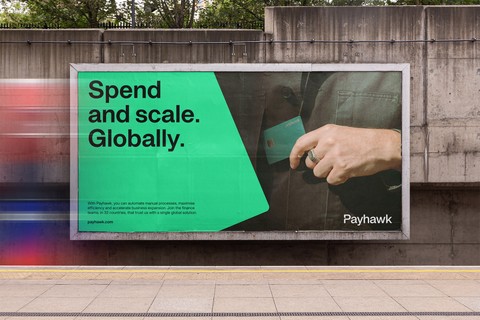
Payhawk, Rebranded.


Payhawk launched in 2018, in Bulgaria with two people and a laser-focussed vision. Now it’s time for our Brand to level up and reflect our global reality.
- Why rebrand, why now?
- A brand is not a logo
- More than a paint job
- What now, what’s next?
By submitting this form, you agree to receive emails about our products and services per our Privacy Policy.
Why rebrand, why now?
Payhawk launched in 2018, in Sofia, Bulgaria with two people and a laser-focussed vision: to become the world’s biggest bank without holding a single cent. Four years on, seven offices and 250 Payhawkers later, and our product powers the fastest growing, multinational companies, and we employ the top 1% of tech talent. As the first Bulgarian unicorn, it was time for our brand to level up and reflect our global reality and direction.
“Our ambition was to bring our strong enterprise-product DNA into the payments world. We saw an opportunity to converge multiple market categories into a single experience for finance teams. And as we have been building and growing our vision, we see that the multinational companies with a growth mentality have been the best customers for us.” — Hristo Borisov, CEO of Payhawk
Mission: Building the technology around business payments to navigate change, together.
Vision: To provide the world’s first seamless payment experience trusted by businesses.
Purpose: Helping businesses achieve their full potential in a constantly changing environment.
Discover smarter, more scalable spend management
A brand is not a logo
A brand is not a logo. I repeat this as often as I can before people’s eyes start to close and here’s why. Branding is about your intentions, your purpose, and the experience you provide. Yes, there are tech purists who will argue that objective value supersedes subjective value, but we need only to look at Steve Jobs’ legacy to see that tech is not that black and white.
It can be challenging to develop an emotionally-resonant brand for a product-led company, but ultimately, your experience of the product matters, and that experience doesn’t start when you use the product, it starts when you initially become aware that it exists. First impressions count — in B2B and B2C — and so long as human behaviour is a factor, perception will always play a key role in a product’s success — branding is the business of influencing that perception.
“Consider the behavioural characteristics of flight attendants, or the experience of getting on an airplane. That is what distinguishes one airline from another. It isn’t the aircraft, it isn’t the product—it isn’t the time it takes. It is the environment, the seating, and the way you are treated.” — Wallace Olins CBE, Founder of Wolff Olins
More than a paint job
“For our rebranding efforts, we had to decide between working with an external creative agency or developing a new brand internally. We were faced with the challenge (and time pressure) of needing to launch our new brand in 5-6 months, which is partly why we decided to hire a brand and creative team to do the work internally. This way, we’d be less dependent on external resources, and instead rely on people who are able to get under the skin of the business.”
— Désirée Schildt, VP Marketing at Payhawk
Starting with a two-day stakeholder workshop in March, we stress-tested Payhawk’s purpose, mission, vision, positioning, messaging and visual identity. Needless to say, there were dynamic discussions, some late nights, and many post-its.
Between then and now, we’ve done a deep dive into the Payhawk offering and audience, in order to articulate what we do to make our customers’ lives easier, and use that root insight to define our brand belief, brand personality, and core organising idea.
Payhawk is sophisticated, future-facing and connected to finance teams. We are immersed in and have a point of view on spend management, and we’re committed to helping businesses grow. So, it was vital that our visual identity matched that ambition.
Starting with our brand colours, we tweaked Payhawk’s primary and secondary palette to signal elegance but strength, before adjusting our wordmark. It was also important to capture our people with bespoke photography; Payhawkers are global but also characterised by specific personality traits that lift up the business — we put our people first, literally and visually.
“To reflect these changes, our wordmark needed to be aligned with where we are headed as a company. As such, the new wordmark is more serious, focussed and incorporates a distinctive notch within the ‘P’. This serves two purposes; to bring a sense of kinetic momentum into our logo (a feeling that runs through our business) and also to reference our core physical product - the company card.” — Kelsen Findlay, Senior Graphic Designer at Payhawk
What now, what’s next?
There’s a lot that’s changed on our website, from colour and photography right through to messaging, and you’ll notice our new logo across our product and social media channels. We know you’re keen to get your hands on our rebranded physical cards, and those are on the way.
As if that wasn’t enough, we just launched in the US and we’re currently at SaasTr Annual showing off our visual identity at booth 701 so, come and say hi if you’re in the San Fran Bay Area.
Stay tuned for more Payhawk-powered updates, you can expect to see a lot more of us.
—
Natalie Reiss — Head of Brand & Creative Strategy at Payhawk
The Payhawk Editorial Team consists seasoned finance professionals boasting years of experience in spend management, digital transformation, and the finance profession. We're dedicated to delivering insightful content to empower your financial journey.
Related Articles


10 key takeaways from SuiteWorld 2025: What they mean for system integrators
